In the past days, the most popular conversation topic among ESN volunteers all over Europe has definitely been the proposed new logo system. With the AGM tasked with voting on this new system on Sunday, heated discussions have been taking place among ESNers both online and offline. In order to better understand the situation that has led us to this point, it would be useful to take five minutes to understand the background of this topic.
What is a logo?
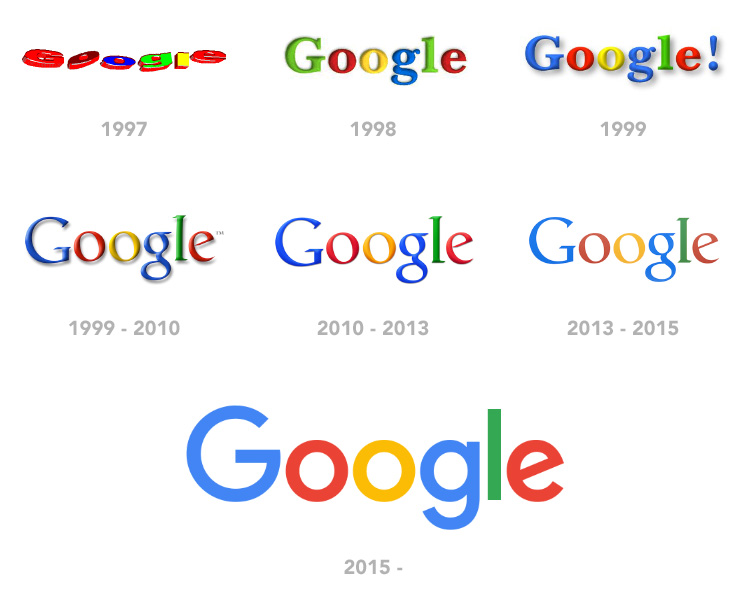
To put it simply, a logo is the face of a company, organisation or other entity - a graphic element that identifies it. It can be a wordmark (such as the logos of Coca-Cola or Google), standalone symbol (Nike, McDonald's) or a combination of symbols and type. A logo itself is usually an empty symbol, until symbolic meaning begins to be associated with it.
For example, the swastika had been used as a symbol of good fortune for thousands of years in many cultures around the world, until it was adopted as the logo of the Nazi party. An effective logo is part of a successful brand image and shares the same tone, visual appeal and story of a brand. Elements such as colours, font choice, shape and style are all key parts of a logo.

Why do brands change their logos?
Although the famous idiom suggests that “if it ain’t broke, don’t fix it”, major brands do not seem to be following this advice. It is not uncommon for brands to be making small or large adjustments to the design of their logos every few years. If the face of the company no longer represents its values and offerings, it might need some updating.
Logos and brands are often updated because of the need to evolve with the market and stay relevant. Rebranding is an opportunity for companies to realign themselves in terms of how they're perceived or how they've changed over time. The current minimalist design trend is also largely affected by a practical reason: the need for logos to be displayed well on all electronic devices and digital media platforms. This was largely the reason behind Google’s September 2015 font change.
Evolution of the ESN logo
In its existence, ESN has had four different logos.
As our first logo, ESN used the same symbol as the one of the first Erasmus programme. It was the stylised head of Desiderius Erasmus of Rotterdam, surrounded with a circle of 12 stars, like on the European flag. It was presumably used from 1991 to 1993.
In 1993, a new logo was approved - now known as the ‘spaghetti logo’. It was designed by the brother of the then-NR of ESN Finland. Although he was asked to include the stylised head of Erasmus from the previous version, it never happened because “his artistic freedom could not have allowed such banal intrusions”, according to the artist.
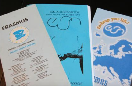
In 1999, an official slogan - Exchange Your Life - was added to the logo. Later, a new layout was introduced to accompany the ‘spaghetti’. These changes were approved as the third logo of ESN in 2000
By 2005, ESN had identified the need for a stronger and more unified corporate identity. The Dutch design agency Koeweiden Postma was selected to design a new logo. The new design was introduced, discussed and approved at AGM Krakow 2006. This time it was not only a new logo, but a set of five colours that were adopted as part of ESN’s brand. A complete visual identity manual was introduced a few years later to encourage correct use of the logo. The current logo and the ESNstar are now widely accepted in the network and the logo can be used with additional details like an added country contour or a section logo next to it.
The need for change?
Brands and their needs evolve over time. It is thus understandable that discussions in the network about a possible update to the logo have been taking place since 2016. Besides being too complex, it is often said that the current logo is too colourful and prone to misuse.
With the network acknowledging the need for change, consultations were held with national communication managers, the Communication Committee and national representatives. It is important to note that this need for change does not simply concern a new logo, but also a complete visual identity system that would unite the whole network. Focus groups with students - who are the main target group of the network - have proven that section logos and project logos currently have a very weak connection to the ESN brand, and is thus very confusing to the students.
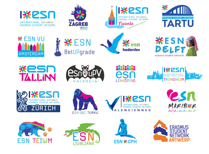
Since the ESNstar is an established and distinctive part of the network’s identity, it will remain the cornerstone of the proposed new logo system. Indeed, the proposal calls for current section logos to undergo change, but this does not necessarily take away sections’ identities as feared by many. It does, however, offer a new challenge for ComCom and its team of designers to implement current traditions such as mascots and symbols into the proposed new framework.
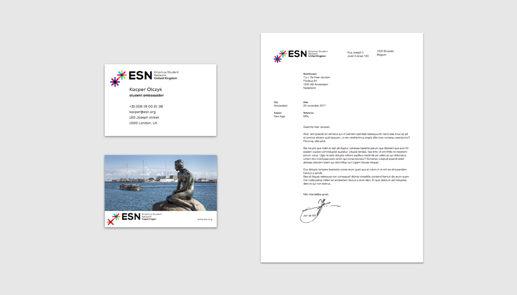
The rebranding of an international organisation is not an easy job, because its members understandably have an emotional attachment to its visual representation. It is important to note however, that decisions of this scale are not only “communication issues”, but long-term strategic decisions, which can help organisations grow.
Follow the AGM on live.esn.org to witness the vote taking place on Sunday morning!
